2024
IDFC FIRST Bank
Mobile App Design
Overview
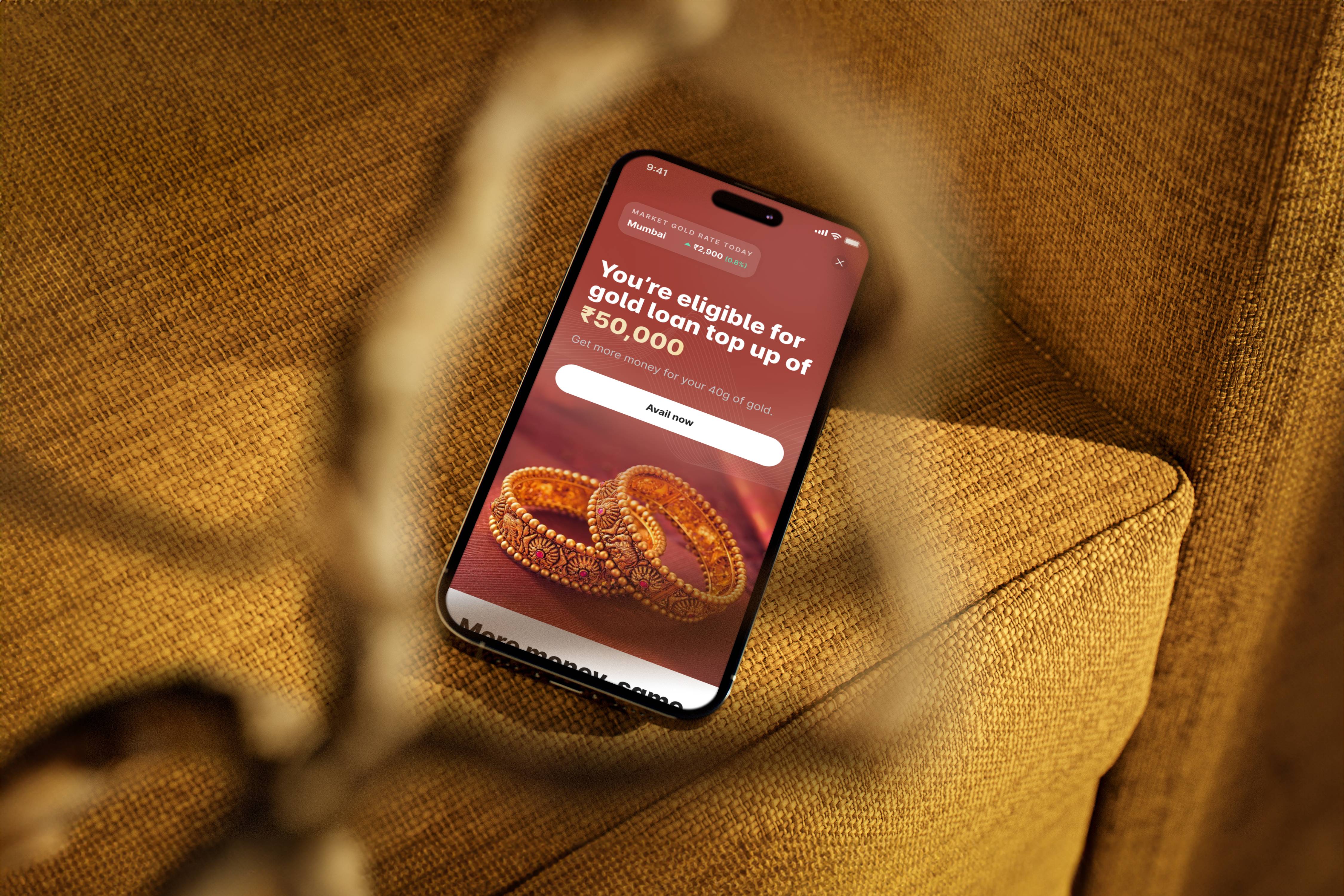
This project focused on designing a Gold Loan Top-Up journey, specifically targeting existing gold loan customers as a first step toward digitizing the gold loan process. Since gold loans in India are traditionally handled offline, our goal was to introduce a seamless, digital-first experience while maintaining the trust and familiarity that customers have with the existing process.
By launching this journey, we aimed to understand user behavior, adoption challenges, and preferences when transitioning from manual, in-person interactions to a digital platform. Our research provided valuable insights into how Indian gold loan customers perceive online transactions, trust factors, and digital convenience.
A key challenge was to strike the right balance between automation and human touch—reducing manual intervention and paperwork while ensuring customers still felt secure and confident in the process. This journey helped us assess the feasibility and user acceptance of a fully digital gold loan ecosystem, paving the way for future innovations in gold loan digitization.
Challenges
1. Understanding User Reactions to a Digital Gold Loan Experience
Gold loan customers in India primarily rely on offline, branch-based interactions for their loan-related needs. Since trust plays a critical role in gold loans, a key challenge was to understand how these traditionally offline customers would perceive and adapt to a digital journey. Would they feel secure and confident in an online process? Would they trust a digital platform to manage something as valuable as their pledged gold? Addressing these concerns was central to our design approach.
2. Simplifying the Digital Experience for Non-Tech-Savvy Users
A significant portion of gold loan customers may not be digitally fluent, making it crucial to design an experience that is intuitive, simple, and accessible. The challenge was to remove complexity while ensuring the journey remained seamless and easy to navigate. This involved:
Minimizing the number of steps required to complete the top-up request.
Using clear, jargon-free language to guide users through the process.
Incorporating visual cues and step-by-step instructions to enhance usability.
Offering assistance or reassurance at key points, ensuring users don’t feel lost or confused.
3. Building Trust: Communicating the Top-Up Benefits Clearly
Since this journey is a top-up on an existing gold loan, it was important to clearly communicate that:
✅ No additional gold needs to be pledged—customers are simply getting extra funds based on their existing loan.
✅ Their current pledged gold remains safe and untouched.
✅ The process is quick, secure, and does not require a visit to the branch.
By emphasizing these assurances upfront, we aimed to eliminate hesitation and build user confidence, ensuring a smoother transition to digital.
Approach
Research and Competitive Analysis
Our research team conducted qualitative interviews with selected gold loan customers across different financial institutions. The goal was to gain deep insights into their expectations, concerns, and preferences regarding the digitalization of the gold loan process.
Some of the key takeaways from the research included:
Customers were eager to reduce paperwork and simplify the loan process.
Many welcomed the idea of a digital platform that allows them to track gold prices and receive alerts about top-up offers based on fluctuations in gold value.
Trust remained a crucial factor, meaning any digital solution had to feel secure, transparent, and easy to use.
To further validate our approach, we conducted a competitive analysis by studying leading players in the gold loan space, including Muthoot Finance, Manappuram, Bajaj Finserv, and others. By analyzing their digital journeys, we identified their strengths, limitations, and best practices, allowing us to draw inspiration while differentiating our offering.
Ideation and Wireframing
With research insights in hand, we quickly moved into ideation, sketching out early concepts for the top-up journey. Our focus was on creating a seamless and intuitive experience while addressing the complexities involved in loan breakups and amount calculations.
We developed initial wireframes and presented them to key stakeholders for early feedback. This allowed us to:
Validate whether the flow effectively addressed user pain points.
Identify potential areas of confusion, especially regarding amount breakup and loan adjustments.
Make rapid iterations based on stakeholder input to refine the journey further.
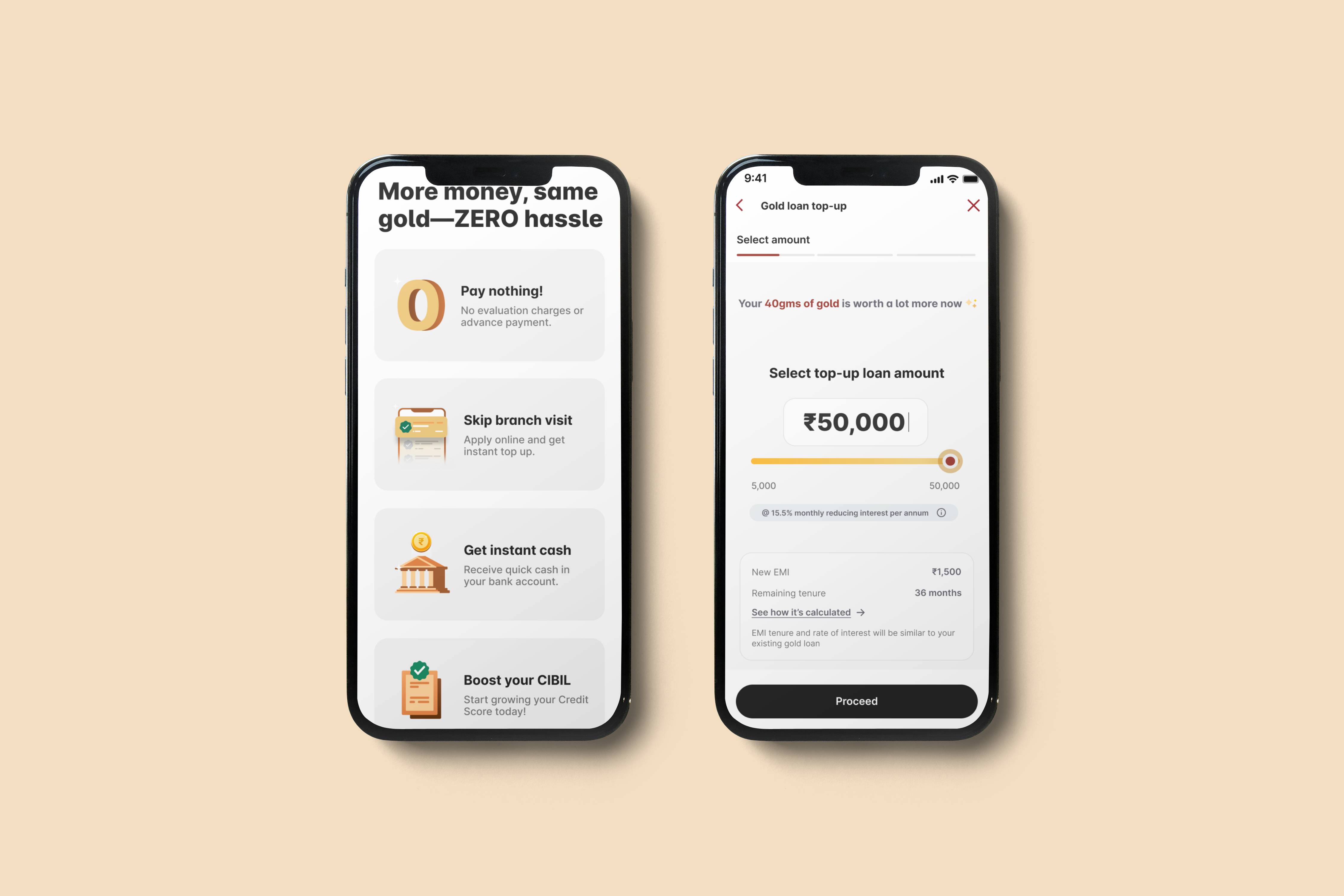
Visual Design: A Balance Between Trust and Modernity
To capture user attention and drive engagement, we designed a compelling landing page with an action-oriented first fold, highlighting the key benefits of the gold loan top-up. Our goal was to create a design that felt modern yet deeply relatable to Indian gold loan customers, maintaining a balance between digital-first aesthetics and the traditional trust factor associated with gold loans.
Key design decisions included:
Clarity in communication: Ensuring all features and benefits were explained concisely.
Carefully chosen colors: A color palette that resonated with Indian users while reinforcing credibility and trust.
Iterative design process: Multiple rounds of refinements based on user testing and stakeholder feedback.
Simplifying Amount Breakup and Loan Calculations
One of the biggest challenges was effectively communicating the amount breakup—how much additional loan a customer could avail based on their existing gold holdings. Since financial calculations can often feel overwhelming, we took a data-driven approach to simplify this step.
We tested multiple variations internally, refining the presentation of loan numbers and breakdown details.
The final version was selected based on usability testing, ensuring it was intuitive and easy to understand even for customers with limited financial knowledge.
By making the amount breakup transparent and visually clear, we enhanced user confidence in the digital journey.
My role
As a Product Designer, I played a key role in shaping the end-to-end design process—from research and analysis to wireframing, visual design, and prototyping. My primary focus was on simplifying the user journey, ensuring a seamless and intuitive experience for gold loan customers transitioning to a digital platform.
I actively contributed to:
✅ Research & Analysis – Collaborated with the research team to understand customer pain points, expectations, and behavioral patterns, which helped define our design direction.
✅ Wireframing & Iteration – Created multiple wireframe variations, refining the flow based on stakeholder feedback and usability insights, especially for landing pages, amount breakups, and loan calculations.
✅ Visual Design & Prototyping – Designed a visually compelling, modern-yet-trustworthy interface that resonated with Indian gold loan customers. Focused on clear communication, trust-building UI elements, and accessibility.
✅ Simplification & User Testing – Developed multiple design variations for critical touchpoints, such as the landing page and loan amount breakup screens. Conducted internal usability tests to determine the most intuitive approach, ensuring the final design was both functional and user-friendly.
By embracing a user-first approach, I successfully contributed to making the gold loan top-up journey simpler, more engaging, and accessible, setting the stage for future digital innovations in the gold loan space.
Key design decisions
A key design decision was to simplify the loan amount breakup while reinforcing trust for gold loan customers transitioning to a digital experience. We made the top-up amount clear and pre-calculated, reducing cognitive load and eliminating confusion. Through user testing, we refined the presentation to be intuitive and transparent, ensuring users felt confident in the process. Trust-building elements like security assurances and clear communication further strengthened adoption and engagement.