2025
IDFC FIRST Bank
Mobile Design
Overview
This project involved a comprehensive redesign of the existing Credit Card Dashboard, which had an outdated user interface that no longer aligned with modern design standards or the evolving features of the app. Compared to competitors, the existing dashboard lacked visual appeal, usability, and intuitive navigation, making it imperative to revamp the experience.
The redesign was extensive and detail-oriented, requiring the creation of new components, improved states, and a more structured layout. Our goal was to enhance user engagement, improve accessibility, and ensure design consistency across the platform. By focusing on modern UI principles, seamless interactions, and a user-centric approach, we transformed the dashboard into a visually appealing, intuitive, and feature-rich experience.
Challenges
Key Challenges in the Redesign Process
1️⃣ Finalizing a Cohesive Theme: One of the biggest challenges was defining a visual theme that not only looked modern and engaging but also blended seamlessly with the overall app ecosystem. The new design had to feel fresh and intuitive while maintaining consistency with the existing app’s aesthetics and branding.
2️⃣ Building a Scalable Component System: The redesign required creating each component from scratch, ensuring every state and interaction was well-defined. This included handling hover states, active/inactive statuses, error handling, and dynamic content changes. The challenge was to make the design system scalable, allowing for future enhancements without compromising performance or usability.
3️⃣ Designing Digital Card Faces Without Losing the Physical Essence: Since users are accustomed to the look and feel of physical credit cards, it was essential to create a digital representation that retained the same essence. The challenge was to balance realism with digital fluidity, incorporating elements such as textures, lighting, and interactive animations to make the digital cards feel authentic yet futuristic.
Approach & Process
1️⃣ Modular Design for Scalability
We adopted a module-wise design approach, where each widget was designed separately before being seamlessly integrated into the final dashboard. This allowed for better flexibility, easier iteration, and improved design consistency, ensuring each module functioned effectively on its own while contributing to a cohesive dashboard experience.
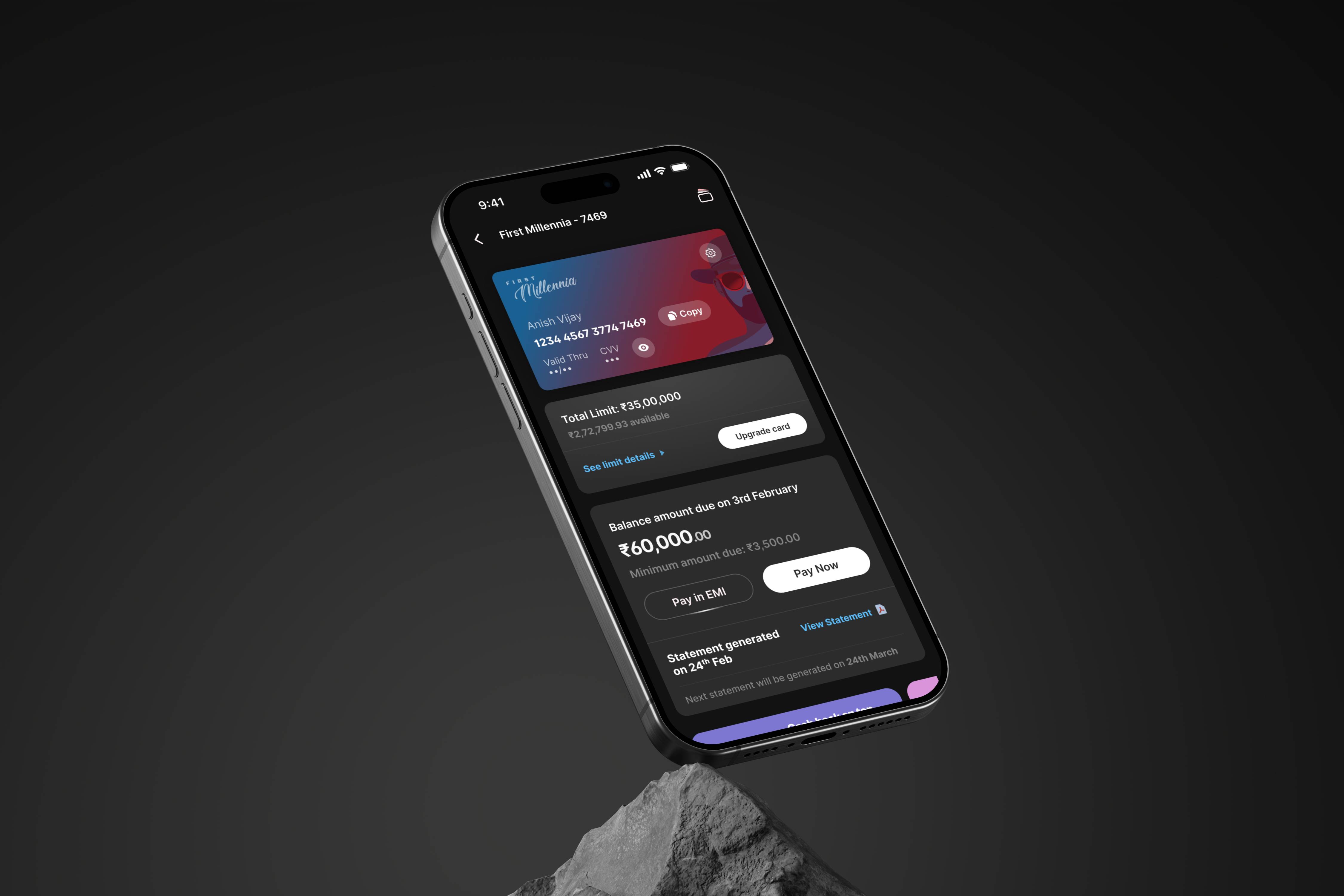
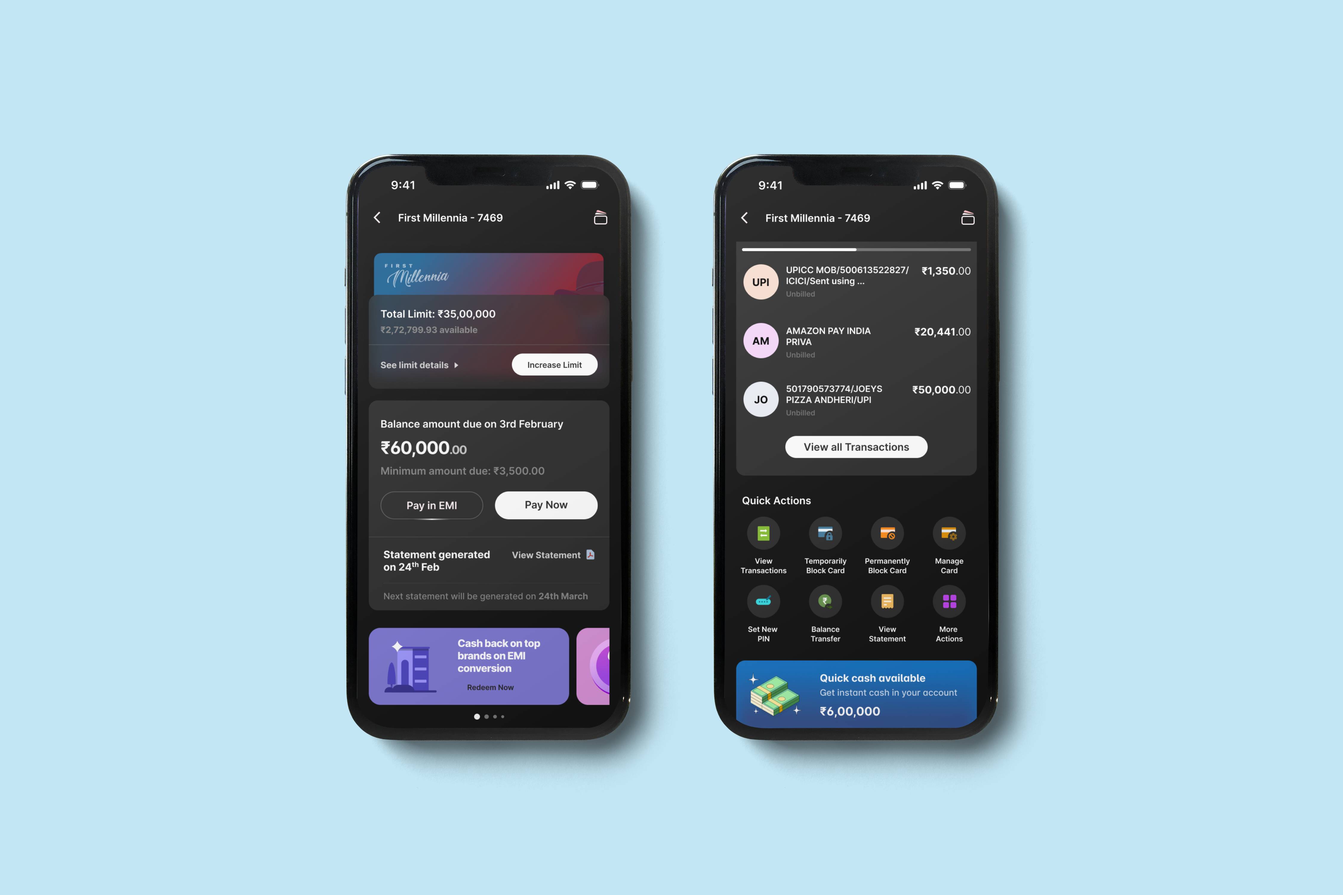
2️⃣ Creating Dynamic Statement Widget States
The statement widget was one of the most complex elements, with multiple states depending on the statement type, billing cycle, and payment status. To streamline this, we created a component-based system, allowing for dynamic state changes and ensuring a smooth user experience across different scenarios.
3️⃣ Refining Iconography with Illustrative Elements
We went through multiple iterations to determine the best iconography style for the dashboard. After experimenting with different types, we finalized illustrative icons with color, which added a layer of visual engagement and accessibility, making key actions and sections more intuitive.
4️⃣ Revamping Merchant Offers, Benefits & Rewards
The offers and benefits section, previously cluttered with banners, was redesigned for clarity and impact. We introduced a refined layout, unique use of colors, and a more structured hierarchy, making rewards and merchant offers easier to navigate and more visually appealing.
5️⃣ Enhancing UX with Micro-Interactions
To make the dashboard more engaging and intuitive, we integrated thoughtful micro-interactions across various touchpoints. These subtle animations provided real-time feedback, improved usability, and added delight to the overall experience without overwhelming the user.
6️⃣ Introducing Dark & Light Mode for Better Accessibility
As the app was transitioning towards a more adaptable UI, we designed both light and dark modes for the dashboard. This not only enhanced accessibility for users who preferred different visual settings but also aligned with the broader app-wide design evolution
My role
I joined the project at a later stage, but this gave me a unique opportunity to bring a fresh perspective to the designs. My focus was on enhancing user experience through micro-interactions, optimizing key UI elements, and exploring new visual themes.
I worked extensively on micro-interactions, ensuring that each interaction felt smooth, intuitive, and delightful. Additionally, I contributed to designing new use cases that improved the overall usability of the dashboard.
A major part of my role involved redesigning the Merchant Offers and High-Performance Banners. I refined their visual hierarchy, improved clarity, and introduced a more engaging layout, making it easier for users to discover and act on relevant offers.
Furthermore, I explored new color palettes and themes, experimenting with different styles to align with the modernized app direction. These explorations played a key role in shaping the final look and feel of the dashboard, ensuring it was visually cohesive, user-friendly, and aligned with evolving design trends
Key design decisions
The decision to use colored illustrative icons instead of traditional line icons brought a fresh, vibrant, and engaging visual appeal to the otherwise monochromatic dashboard. These icons not only enhanced aesthetic appeal but also improved visual hierarchy, making it easier for users to identify key features and actions at a glance. The use of color and illustration added personality to the interface, making interactions feel more dynamic and intuitive.
Additionally, we adopted a module-based design approach, where each section of the dashboard was designed and developed independently before being seamlessly integrated into the overall layout. This method significantly accelerated the design process, allowing for faster iterations, easier scalability, and efficient collaboration between design and development teams. It also ensured that each module maintained design consistency while being flexible enough to accommodate future enhancements