2024
IDFC FIRST Bank
Responsive Web Design
Overview
This project is an online two-wheeler marketplace, designed as an integral part of the two-wheeler loan journey targeting 10 million users actively searching for two-wheelers online in India.
The initiative involved a complete revamp of an existing marketplace, aligning it with modern design standards, user expectations, and business goals. The primary objective was to enhance the browsing and purchasing experience, making it more seamless and intuitive while driving a significant increase in loan applications.
By refining the user journey, UI, and overall usability, this marketplace aims to bridge the gap between vehicle discovery and financing, ultimately making two-wheeler ownership more accessible for millions of users.
Challenges
Key challenges included aligning the business team during primary market research and convincing stakeholders of its value for a user-centric marketplace. We also negotiated a streamlined MVP, balancing impact and scalability. These efforts compressed the timeline, requiring rapid decisions, fast iterations, and close collaboration to deliver a high-quality marketplace.
The Approach
1. Market Research: Understanding Users & the Two-Wheeler Market
We began with in-depth primary market research to gain a deep understanding of the two-wheeler market and user behavior. This phase included:
Qualitative interviews with two-wheeler loan users to understand their motivations, concerns, and decision-making process.
Competitive analysis to evaluate existing marketplaces, identifying strengths, gaps, and opportunities for differentiation.
Heuristic analysis to assess the usability of the current platform and pinpoint areas for improvement.
Data collection & statistical analysis to uncover trends in user preferences, purchasing behavior, and financing patterns.
This research provided valuable insights that shaped the foundation of our design decisions.
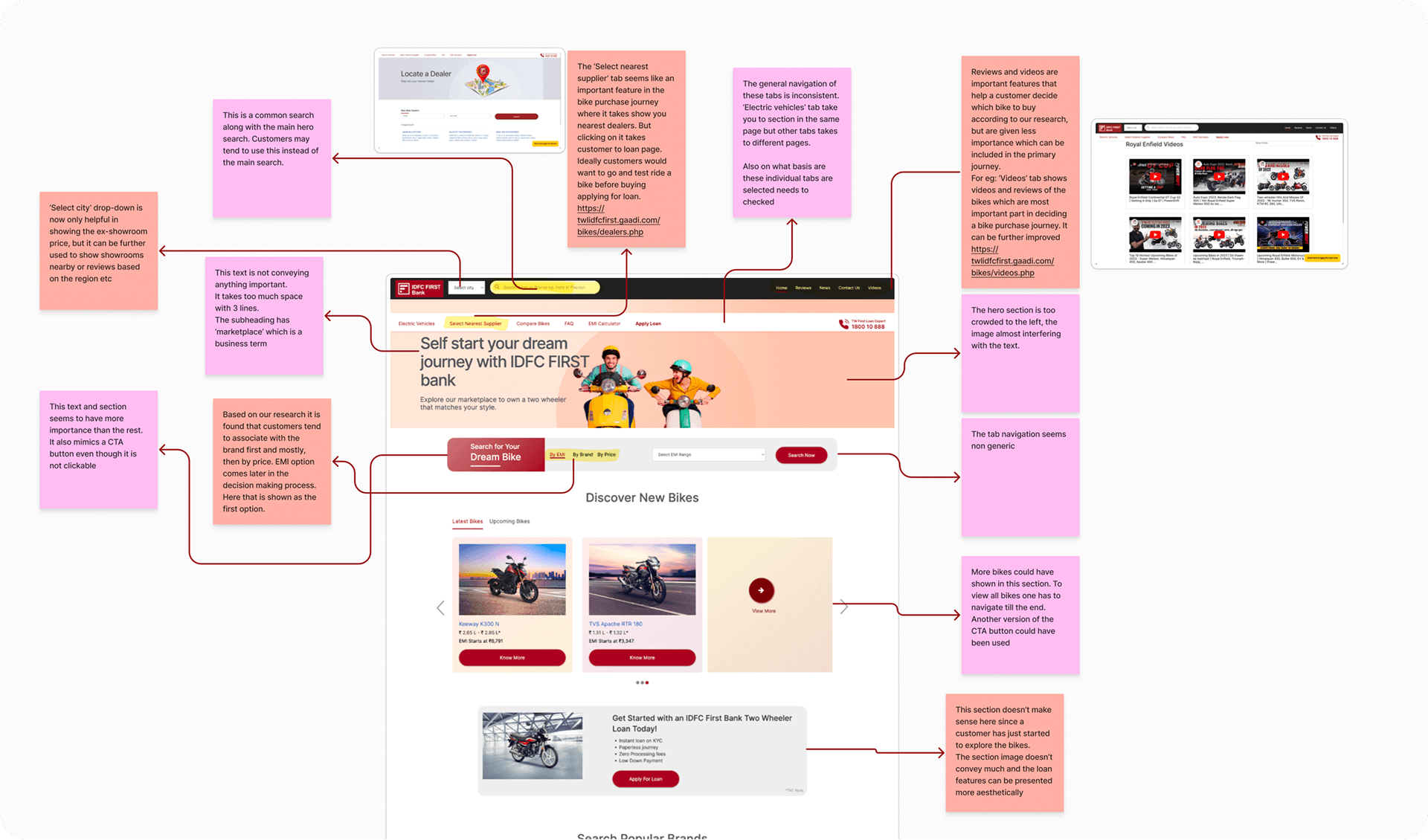
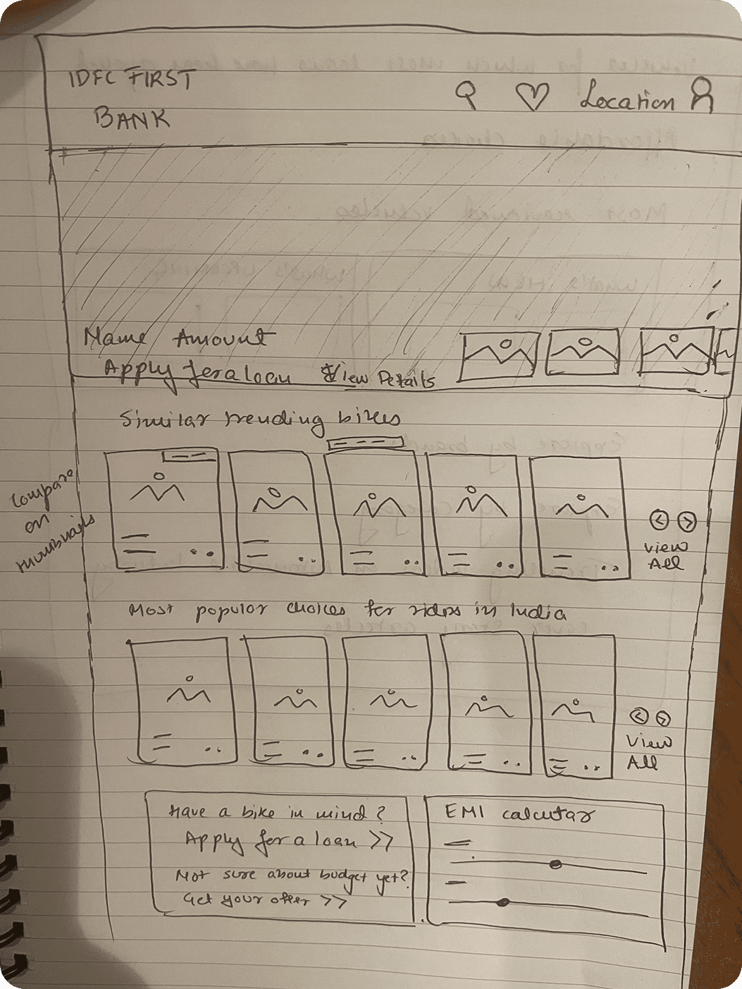
We did a UX teardown of the current markeplace. Here is the part were we did the home page:
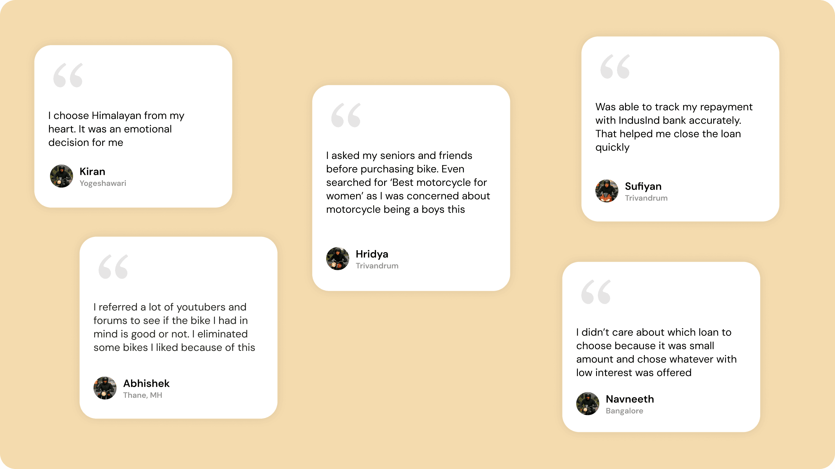
These are some exerpts from the users we interviewed
What users has to say:
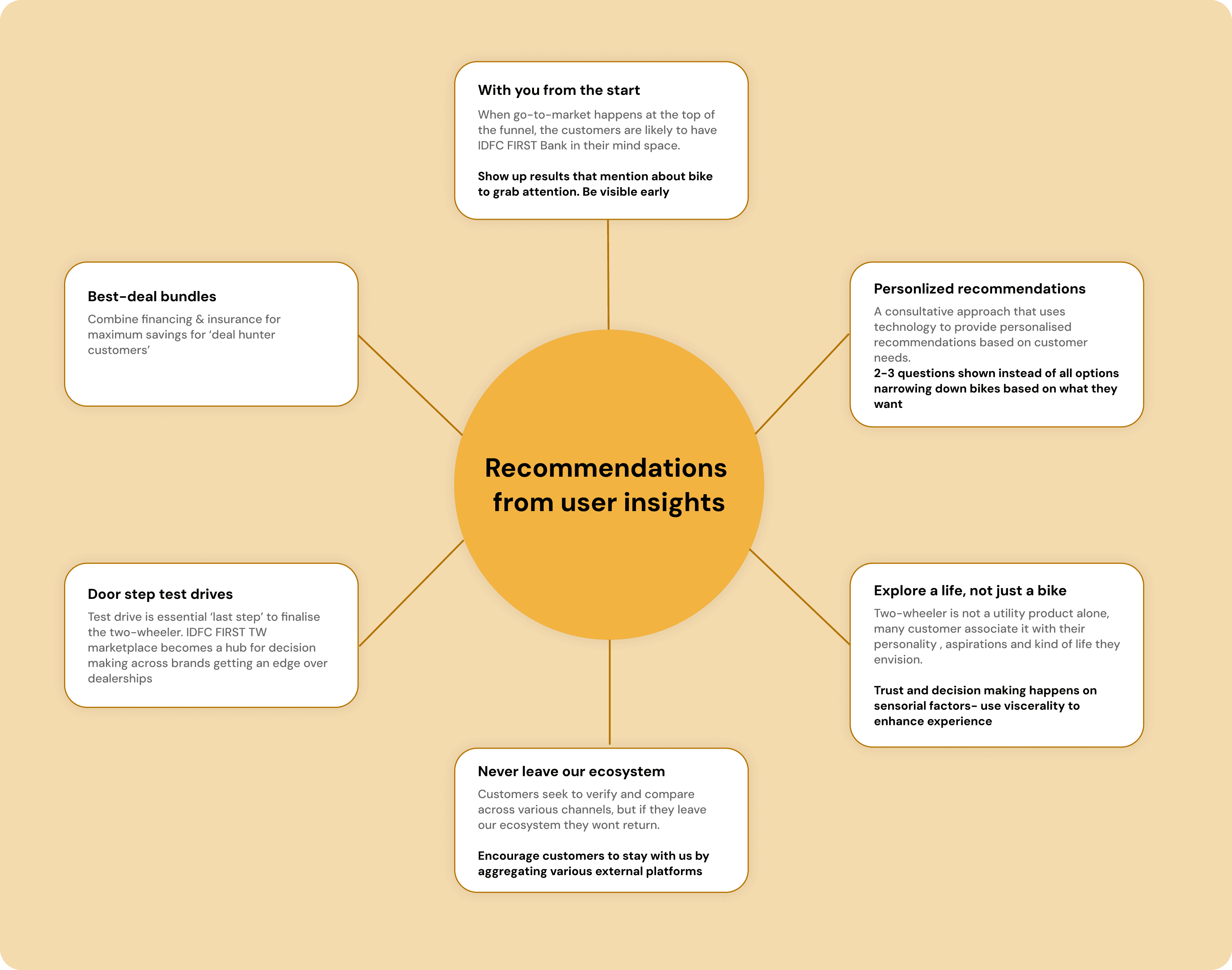
From interviewing we got valuable insights and with the points found out through the primary research we came up with the some recommendations that could shape the marketplace better.
Here are they:
2. Stakeholder Alignment: Presenting Research & Defining Features
Once the research phase was completed, we synthesized key findings and presented them to stakeholders. This helped us:
Align on core user needs and pain points that needed to be addressed in the new marketplace.
Gain buy-in for a user-centered approach by demonstrating how design choices would directly impact business metrics.
Prioritize features for Phase 1, ensuring we focused on high-impact functionalities while maintaining a clear roadmap for future enhancements.
3. User journey flow and ideas
We mapped the end to end user journey based on the finalised features and go ahead from the stakeholders. Few of the recommendations were prioritised for Phase 1
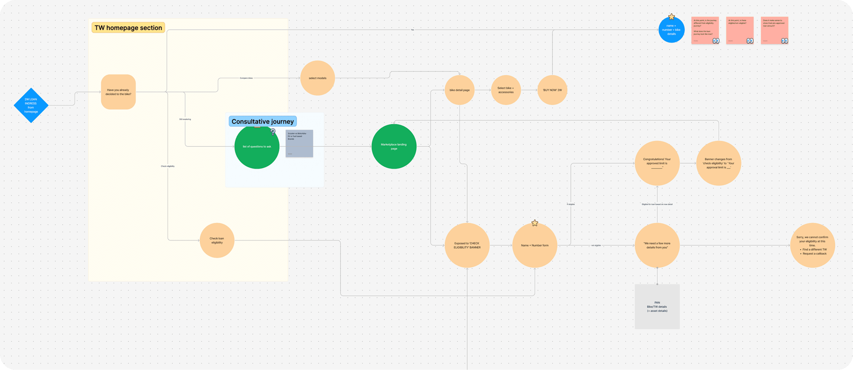
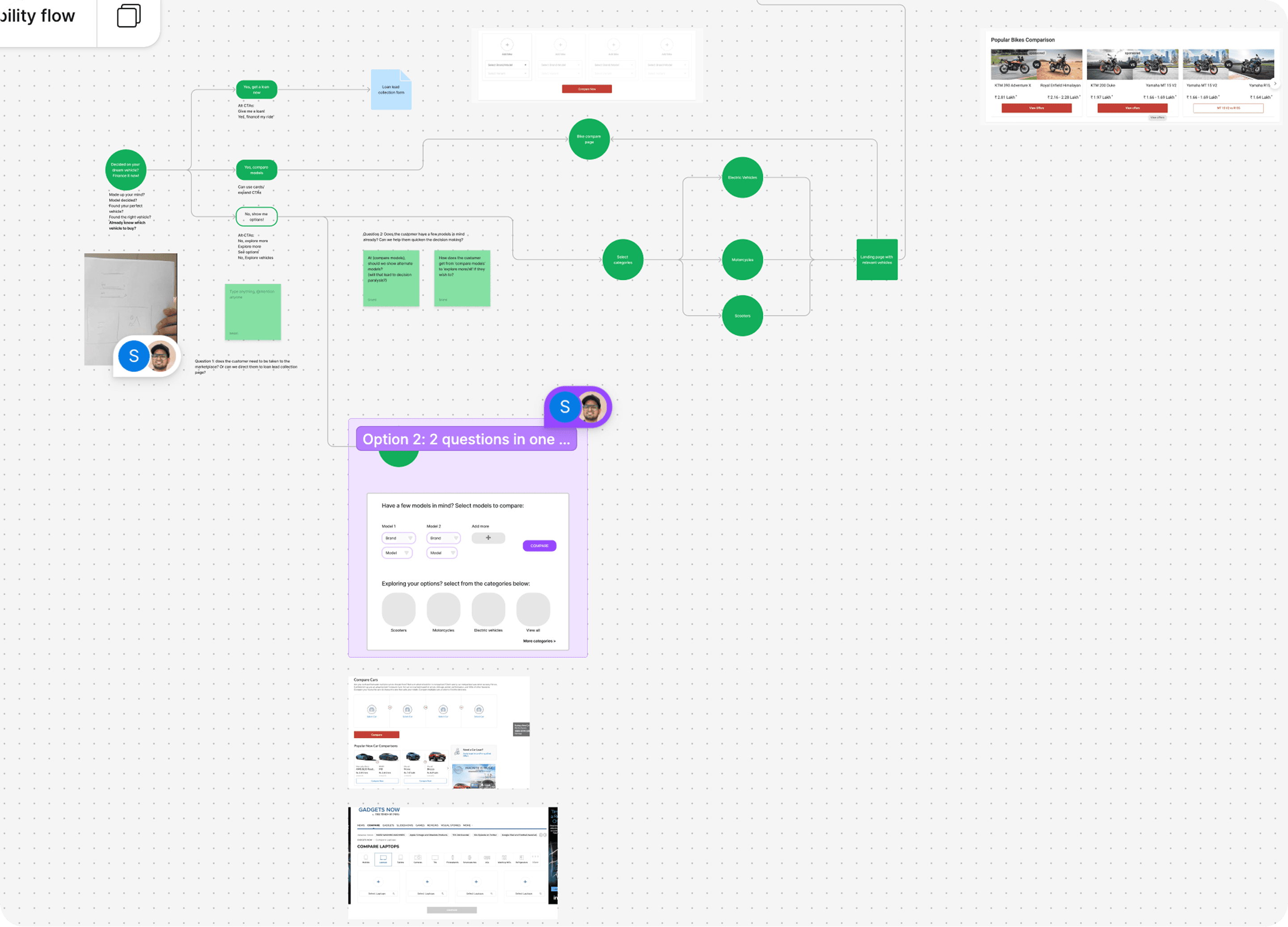
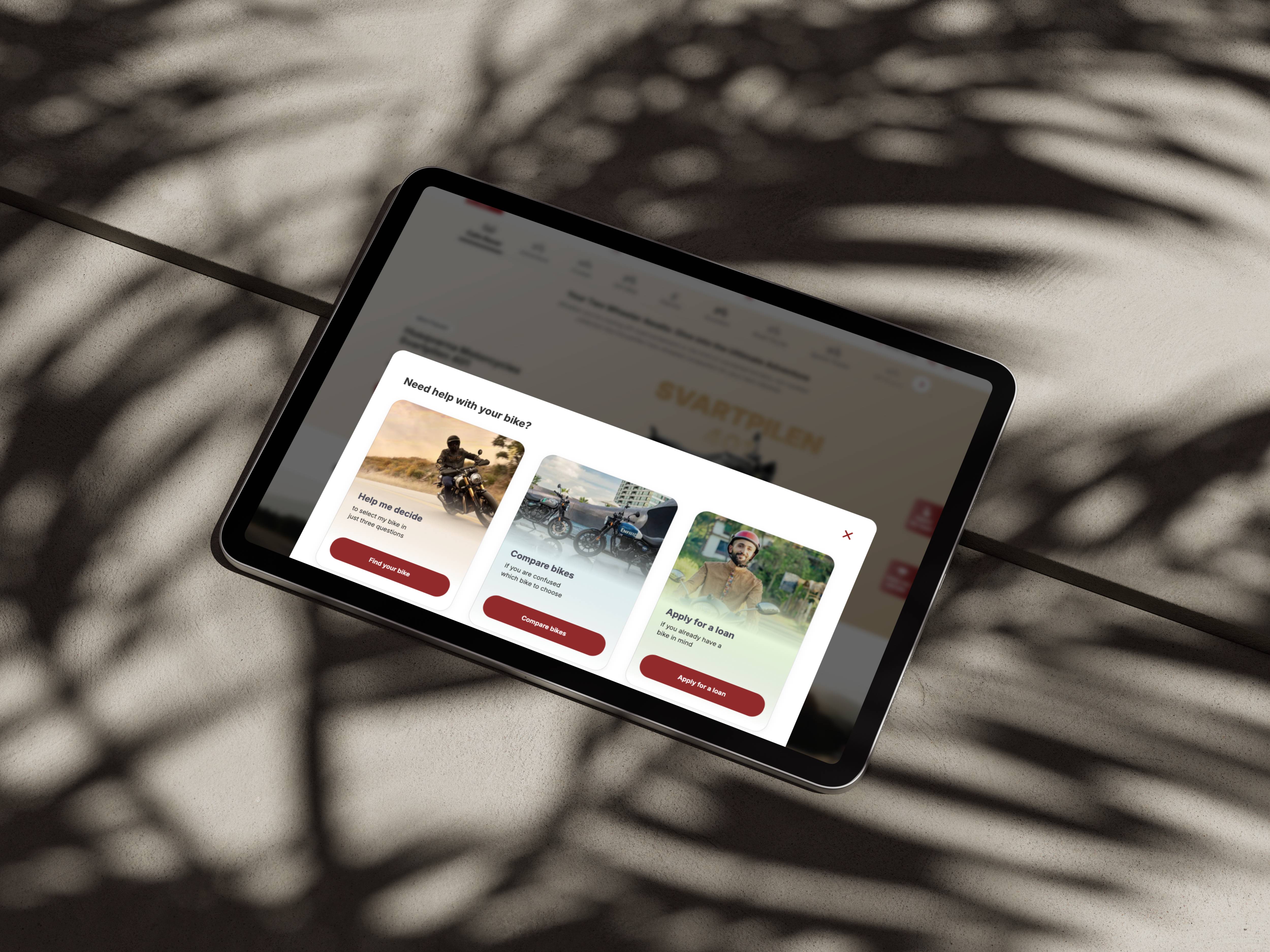
To enhance the browsing experience, we introduced a need assessment step, allowing users to:
Filter and receive personalized recommendations based on their specific needs, budget, and preferences.
Make informed decisions faster, reducing overwhelm and increasing user confidence in their purchase.
This feature played a crucial role in guiding users toward the right two-wheeler options, ultimately improving conversion rates.
4. Wireframing: Structuring the Experience
We started by creating low-fidelity wireframes to map out the user journey and key interactions. Research insights revealed that users were emotionally connected to the visceral aspects of bikes, such as aesthetics, performance, and real-world appeal. Stakeholders also emphasized the importance of capturing this emotional engagement in the marketplace experience.
With this in mind, we designed wireframes that:
Balanced function and emotion, ensuring users could efficiently browse, compare, and explore bikes while feeling connected to the product.
Prioritized visual storytelling, integrating high-quality imagery, immersive layouts, and dynamic elements to enhance user engagement.
Streamlined navigation to make it easier for users to explore and take action without friction.
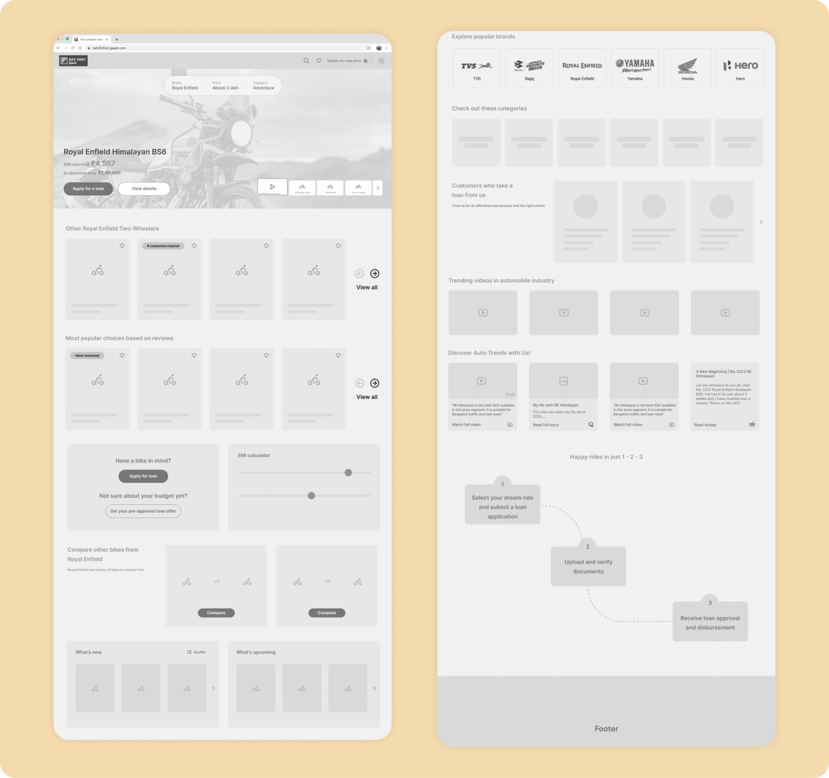
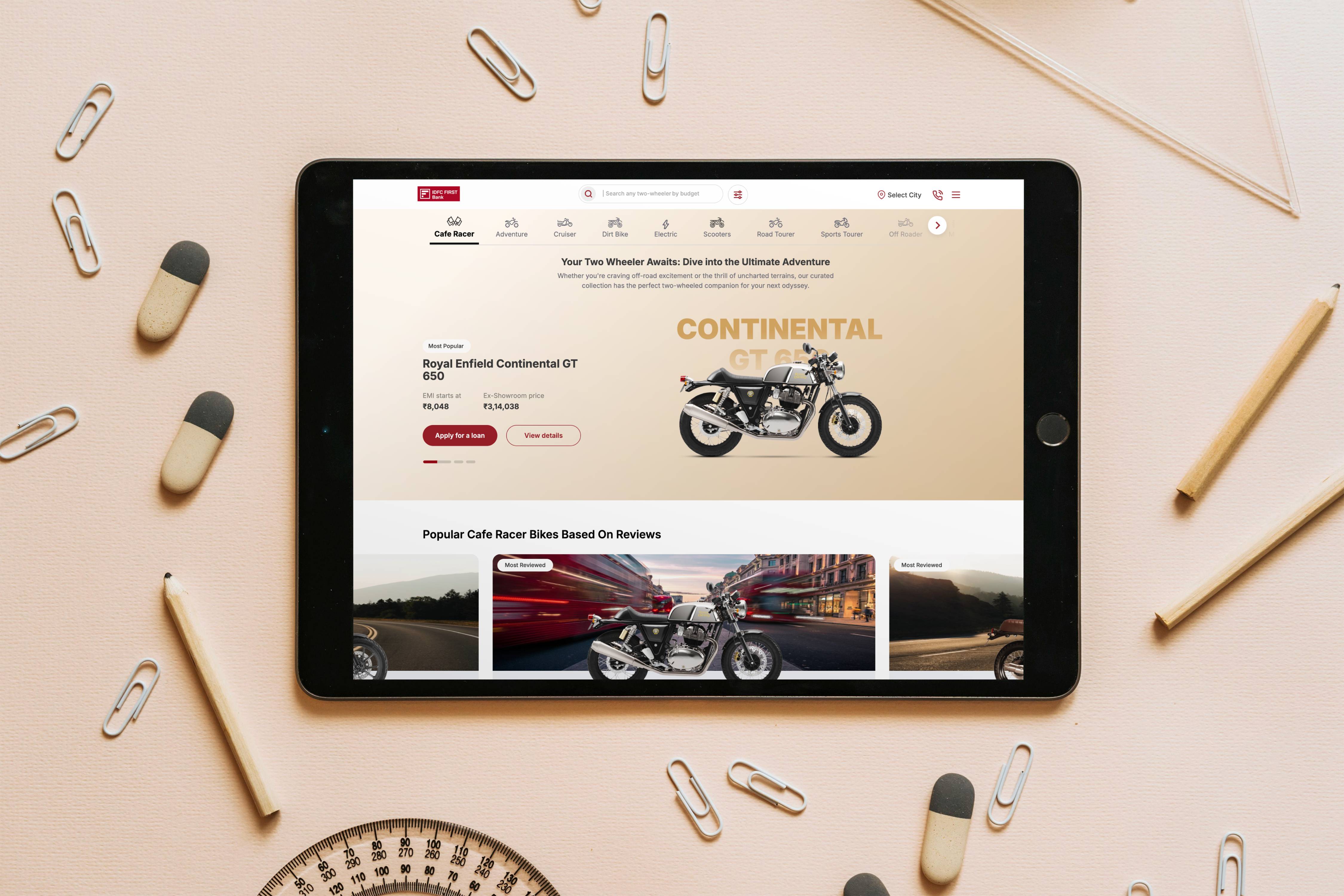
5. Visual Design: Bringing the Experience to Life
After an extensive iteration cycle based on feedback from stakeholders and usability insights, we transitioned from wireframes to high-fidelity visual design. Our focus was on:
Seamless transitions and fluid motion to create an engaging, modern experience.
Breaking away from traditional marketplace designs, ensuring a fresh, user-centric approach that felt both aspirational and functional.
Refining UI components, typography, and layout to establish a visually cohesive and intuitive interface.
6. Developer Handoff: Ensuring a Pixel-Perfect Implementation
We maintained close collaboration with developers, ensuring the final product matched our design vision. This involved:
Regular in-person and virtual sessions to clarify design specifications and interactions.
Providing detailed design documentation, motion specs, and assets to maintain accuracy.
Iterative feedback loops to refine the implementation and ensure a smooth user experience.
Through this tight-knit collaboration, we successfully brought the marketplace to life while maintaining the intended design quality and usability.
Key Improvements & Impact
✅ A modern, simplified, and delightful user interface—enhancing engagement and ease of use.
✅ A need assessment journey—helping users find the perfect bike effortlessly.
✅ Seamless integration with dealers and loan applications—reducing friction in the purchase process.
✅ Increased user traffic and engagement—validating the impact of the redesigned marketplace.
My role
Being involved from the project’s inception gave me a strong grasp of its strategic direction and design approach. Early collaboration with the research team and direct user interviews provided deep insights that shaped a user-centric design. As a Product Designer, I led the design lifecycle end-to-end—from research and wireframing to high-fidelity designs, usability testing, and deployment—ensuring consistency, smooth handoffs, and continuous UX refinement.
Key design decisions
Research-Driven Design: Shaping the Project with User Insights
Our initial research gave crucial insights that guided user-focused design decisions. After launch, we showcased the product to the same users, receiving overwhelmingly positive feedback. Their responses validated our approach and confirmed we had successfully translated early insights into a seamless marketplace experience.
Seamless Collaboration: Daily Design-Development Syncs
To ensure smooth execution and reduce friction between design and development, we implemented a daily design connect with the development team. These sessions served multiple purposes:
✅ Clarifying design-related queries in real-time to avoid misinterpretations.
✅ Providing quick feedback on UI/UX implementation to maintain design integrity.
✅ Addressing feasibility concerns early on to refine solutions proactively.
✅ Fostering continuous collaboration, ensuring that both teams worked in sync rather than in isolated silos.
By maintaining open communication and a structured feedback loop, we streamlined the development process, minimized rework, and ensured that the final product stayed true to the original design vision.
Business and engagement metrics
Through marketplace 13,500+ loan sanctions were created and a business of 1346 Crore was generated. More than 1,12,000+ users has visited the marketplace till March 2025