2024
IDFC FIRST Bank
Mobile Design
Overview
When a user receives a new credit card, they need to set up a PIN and manage various card controls, such as enabling or disabling transactions. The new credit card unboxing journey transforms this process into a seamless and delightful experience—right from the moment they reveal their card to the effortless activation and customization of its features
Challenges
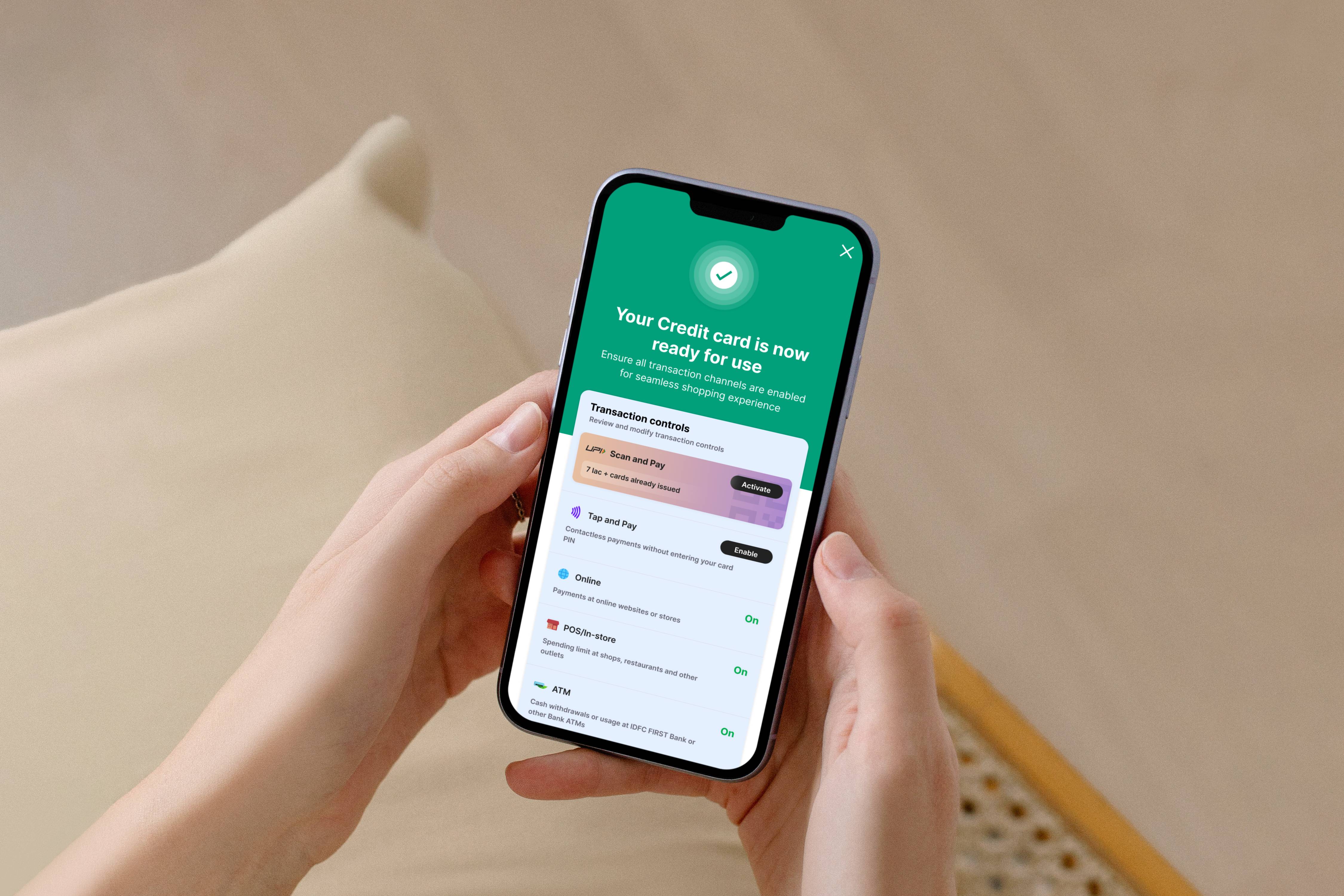
Previously, setting up a PIN and managing card controls was not a straightforward process. Users had to manually locate their new credit card within the dashboard before they could activate and configure it, making the experience less intuitive. Additionally, the outdated UI design lacked clarity and failed to showcase the key features and benefits of the card, leaving users unaware of the full range of functionalities available to them
Approach for Card unboxing
1. Crafting an Immersive Onboarding Journey:
We reimagined the credit card activation process as an engaging onboarding experience rather than just a setup task. To spark curiosity, we designed an intuitive animation that guides users through the process while strategically placing the card ingress in multiple locations for easy access.
2. Adding Delightful Elements:
To create a more engaging experience, we introduced a captivating animation video that visually communicates that the card is designed for digital use. The entire journey is infused with delightful micro-interactions and engaging elements that keep users hooked throughout the process.
3. Simplifying the UI for Seamless Setup:
Instead of requiring users to manually configure every card control, we streamlined the process by enabling frequently used transactions by default. Users still have the flexibility to customize these settings on the success screen, ensuring both convenience and control.
4. Data-Driven Decision Making Through A/B Testing:
To validate our approach, we conducted A/B testing with two different onboarding flows—one using an Instagram story-like format to introduce features and another with a more direct, minimal approach. The results revealed that the majority of users preferred the simpler, more straightforward experience, leading us to refine the final design accordingly.
Prototype:
My role
As a Product Designer, my primary responsibility was to enhance the overall journey, making it more visually engaging and delightful for users at every touchpoint. I collaborated closely with our motion designer to conceptualize and craft compelling animations, ensuring they seamlessly integrated into the experience. This involved working on storyboards, refining motion design details, and aligning animations with the brand’s personality to create an intuitive and immersive flow.
Additionally, the journey was under close scrutiny from key stakeholders, requiring meticulous attention to detail. I took a conscious and iterative approach to ensure a pixel-perfect experience—balancing aesthetics, usability, and business goals.
Key design decisions
Enabling frequently used transactions by default was a strategic decision aimed at streamlining the user journey. By reducing the number of steps required during the initial setup, we eliminated unnecessary friction, making the process more seamless and efficient.
This approach also helped in minimizing cognitive load, ensuring that users weren’t overwhelmed with too many choices upfront. Instead of forcing them to make multiple decisions immediately, we provided a pre-configured, user-friendly default state while still offering the flexibility to modify settings later on the success screen.
By balancing simplicity and control, this decision improved the overall user experience, making the onboarding process faster, more intuitive, and less mentally taxing for users.